Graphic Design Inspiration from Popular Websites
Spice up photos with graphic effects that grab attention not only on your website but when posted on Twitter or other social media. To help give inspiration we've scoured the web looking at some popular web sites to see what they are doing and then show you how to get the same design in Genolve. If you spot a design you'd love to get on your site, tell us about it and we'll get it in a future post. These sites were chosen for having interesting graphics, a consistent approach and/or being very popular.
Mental Floss: Graphically Asking a Question
Buzzfeed: Meme-like Labels
Fast Company: Standout Images
Huffington Post: Standout Products
Popular Mechanics: Super Simple Product Highlights
Mental Floss: Graphically Asking a Question
A question headlined blog is a good way to draw in readers. Mental Floss uses it often and has an excellent graphic to go with it: sun rays background with a thought bubble around a picture of the topic item and a huge question mark to up the curiosity factor.
Graphically Asking a Question

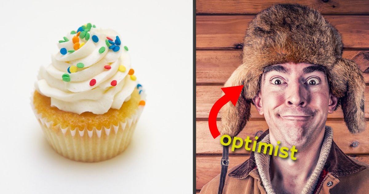
Buzzfeed: Meme-like Labels
Buzzfeed's pics are garish from a graphic design point of view, however, it is an attempt to channel people's love of memes using the meme formula; typically two pictures side by side with loud labels, often including arrows.
Meme-like Labels

Fast Company: Standout Images
Fast Company makes a plain vanilla image stand out by adding flair and tints. Flair can be geometric shapes or any kind of embellishment added to an image. On stock photo sites you can often find images already spruced up like this but it is good to know how to do it yourself. Gaze at the image a while and this question will come up: how do you get the rings behind the person? Answer: place a person with a transparent background over an office scene. Finally, both images are tinted to help the person standout even more.
Standout Images

Huffpost: Product Highlights
It's really hard to get products noticed. The Huffpost shopping section highlights various products with an almost standardized format. Place two or three products (w/ transparent background) on top of a graphic such as a sunburst, geometric shape or gradient background. You probably don't have product shots with a transparent background, no problem, if you have a solid color background it can be stripped out. Look for the 'mastering green screens' tour in the help section. Finally notice how a 3D effect is suggested by placing the foreground stars over the product and the background stars behind.
Product Highlights

Popular Mechanics: Super Simple Product Highlights
Popular Mechanics product reviews show how simple product highlights can be; place a transparent highlight over the image - now that's taking it literally. Note you still need a clean white background and for best effect color-coordinate the highlight with another color on your web page.
Super Simple Product Highlights
